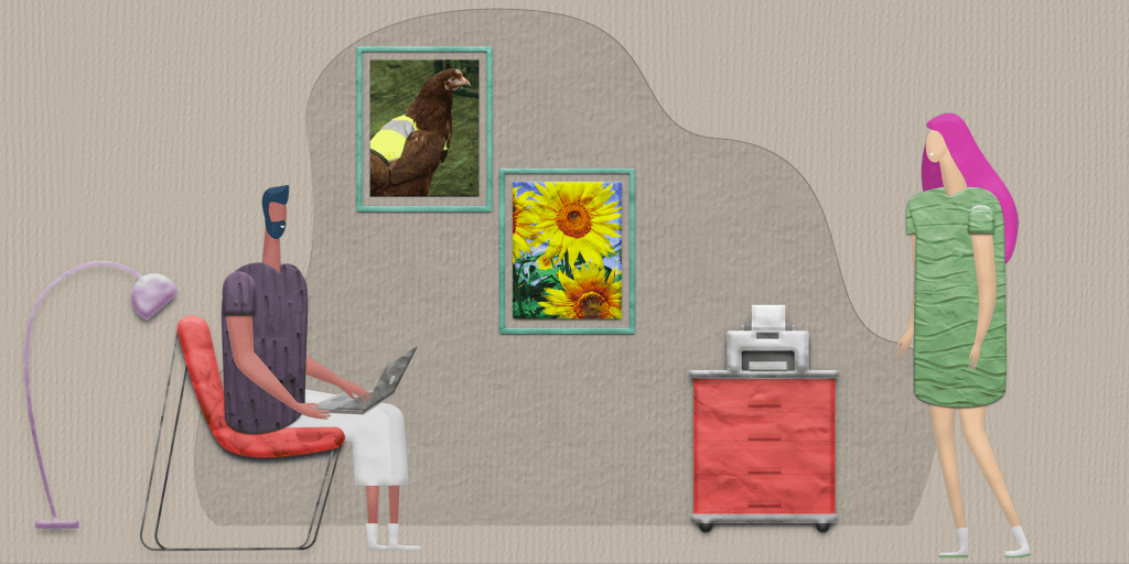
Why did the chicken cross the road in a high-visibility jacket? It’s no yolk. As crazy as it sounds, a company called Omlet in the UK has invented a high-visibility jacket for chickens to keep them safe while crossing the road.
Making your text highly visible over a busy background is no laughing matter, though. If people can’t read the text on your image at a glance, they won’t bother trying to decipher what it says. And when you’re creating an image for social media, for instance, where people just skim down the page fast, that’s not just bad — it’s fatal.
So how do we make text stand out against a busy background? The key is to create enough contrast to make the text ‘pop out’ from the image behind it. Here are several ways that I’ve found to make the text highly visible.
1. Use white text on a busy background.

This is a great start to making the text stand out. But as you can see, it’s not enough on its own. You can barely read the word “are”.
When deciding where to position your text over your background, look for where the shadows are in the image, and which area is darkest and most consistently colored. In this case, it’s across the bottom. The yellow and blue at the top contrasts too much with each other. And there is still a lot of contrast in the middle section between the yellow and green. At the bottom, there is mostly dark green. So we’ll put the text at the bottom.
2. The strong shadow effect.

When you add a strong, dark shadow behind the text, it becomes much easier to read. You’ve added both contrast and depth in one go. Try to imitate the real shadows in your image. Which direction is the light coming from? Sample the colors from the shadows in the image — are they pure black, or gray, or in this case, a very dark shade of green? Make sure you use the ‘multiply’ blend mode, rather than ‘normal’, and experiment with different percentages. In real life, shadows are transparent, not opaque. Adjust the distance of the shadow behind the text so that the whole edge of each letter is clear on every side. Find a combination that makes the text stand out enough.
In this example, the shadow looks opaque, but it’s really only 85% using the multiply blend. Any stronger and it doesn’t look like a shadow, and any weaker and the text doesn’t stand out enough.
It’s important to note that the text isn’t as readable as it could be if you used other options here. See how the word “are” is still a bit tricky to read with the bright sunflower directly behind it?
Carefully check what the focal point is. The focal point of the image is still the sunflowers, not the text. When you first look at the image, you see the sunflowers first. Do you want the primary focus of the whole image to be the subjects of the photo, or the text? If your text plays a secondary role, like a caption, this can work well. If you want the text to be the primary focus, then use one of the following options instead.
3. The opaque shadow effect.

For this effect, use a very dark shadow color from the image and create a fully opaque shadow. This is very similar to using a stroke, but the shadow is different because it’s thinner and thicker in different areas, rather than one constant thickness all around. This creates an almost 3D effect. Make the shadow spread out further than in the above effect, so that it extends noticeably outside of every edge of the text.
If you use black, the contrast may be a bit too stark and unnatural. That’s why in this example I used a dark green.
The focal point in this version has shifted more to the text. It lacks the depth of having a semi-transparent shadow, though.
4. The soft shadow effect.

The soft shadow behind the text provides depth and contrast in a more subtle way. The shadow is transparent and not pure black. The size of the shadow is large enough to blend into the background with blurry edges.
The strong point of this technique is its subtlety. It looks natural and unforced.
5. The soft shadow plus thin stroke effect.

Add a thin dark stroke (outline) to the soft shadow effect, and now the text is well and truly the focal point of the whole image. Notice how clear the text is against the background.
6. The thick semi-transparent stroke effect.

Use a thick dark semi-transparent stroke (outline) with ‘multiply’ as the blend mode so you can just see the colours and contrast behind the stroke. This doesn’t add depth, but it does make the text pop out clearly, without putting the background behind it in a large shadow like in the previous two effects.
7. The dark semi-transparent shape effect.

Using a dark box behind the text gives the contrast you need to make the text stand out. By making the box semi-transparent and using the multiply blend mode, you don’t lose any of the actual detail of the background like you would if it was opaque.
The box is obviously not part of the original photo, and this ‘artificiality’ makes the text the definite focal point of the image.
You can experiment with different shapes. Here it is a strip that runs the full length of the image. You can also see what happens if you use a rectangle that doesn’t reach one or both edges. You can also experiment with using a circle as the shape for a totally different look. (If you used a circle, I’d suggest putting it in the center of the image, and you’d need to use smaller text broken up into multiple lines to make it work.)
8. The dark semi-transparent shape plus a thin stroke effect.

By simply adding a thin stroke to the above effect, the text stands out even more clearly. There’s no denying that the text is the strong focal point of the image now.
9. The blurred background with text shadow effect.

If your text is the primary focal point of the piece, and the background is just playing a supportive role, you can try blurring the entire background. There’s no mistaking that there are sunflowers in the background — you don’t have to blur it into oblivion. The text can go right in the center of the image. You couldn’t make the text any more prominent. (If you added a shape behind it, it would probably be overkill.)
10. Darken the whole background

The most common solution is to darken the entire background. While shadows went out of fashion in the past few years, designers were mostly limited to this solution. But shadows and depth are back, thankfully, so we aren’t stuck with just this option. If nothing else works, though, this is the most foolproof option.
Real world examples
KatchMe uses white text over darkened background videos and images. Notice how the white t-shirt the man is wearing is actually light gray compared the the bright white text.


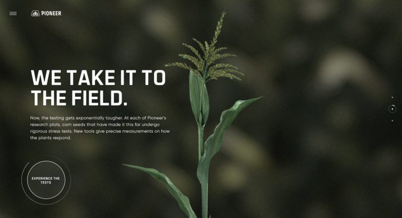
Pioneer darken the entire background dramatically, and also use backgrounds with large less detailed areas behind text.

Tennessee Aquarium uses white text over a video. The entry window information under the headings have a dark semi-transparent rectangle that makes it easier to read. The headings could use some more contrast as well — it works with the seahorses a lot better than with the crustacean.


In a nutshell
Use white text plus shadows, outlines (strokes), dark semi-transparent shapes, blurring, or a combination of these to make your text much easier to read over a photo or detailed image.
Action step
Now you have 10 different ways to put a high-visibility jacket on your text, to make it stand out against a busy background. And I didn’t even make any chickens look silly in the process.
